Table of Contents
Most people check the price. Fewer check what’s behind it.
Tokenomics is the economic design of a token: the rules that determine how it’s created, distributed, and what kind of pressure it faces over time. It doesn’t tell you what a token costs today. It tells you what forces are shaping what it might cost tomorrow.
A token can look attractive based on narrative alone: a compelling story, a well-known team, a trending category. But its supply schedule, unlock calendar, or demand mechanics can completely change the investment picture.
Tokenomics won’t predict the future. But it gets you past the marketing and into the mechanics.
What Is Tokenomics and Why Does It Matter So Much?
The word combines “token” and “economics,” and that’s roughly what it covers. Tokenomics describes the full economic design of a cryptocurrency or digital token: how much exists, how it gets distributed, what gives it value, and how those factors interact over time.
It’s a broader concept than supply alone. Good tokenomics analysis also covers who holds a token, when locked allocations become tradeable, how the protocol handles inflation, and what people actually need the token for. Two projects with identical circulating supply figures can behave completely differently depending on distribution, utility, and emissions.
Price is partly determined by supply and demand dynamics that tokenomics shapes directly. A token with a strong narrative but a large upcoming unlock, thin utility, and high inflation may face real headwinds – even if the broader market is performing well.
Price is a signal. Tokenomics is the system producing it.
How Does Supply Shape a Token’s Price Potential?
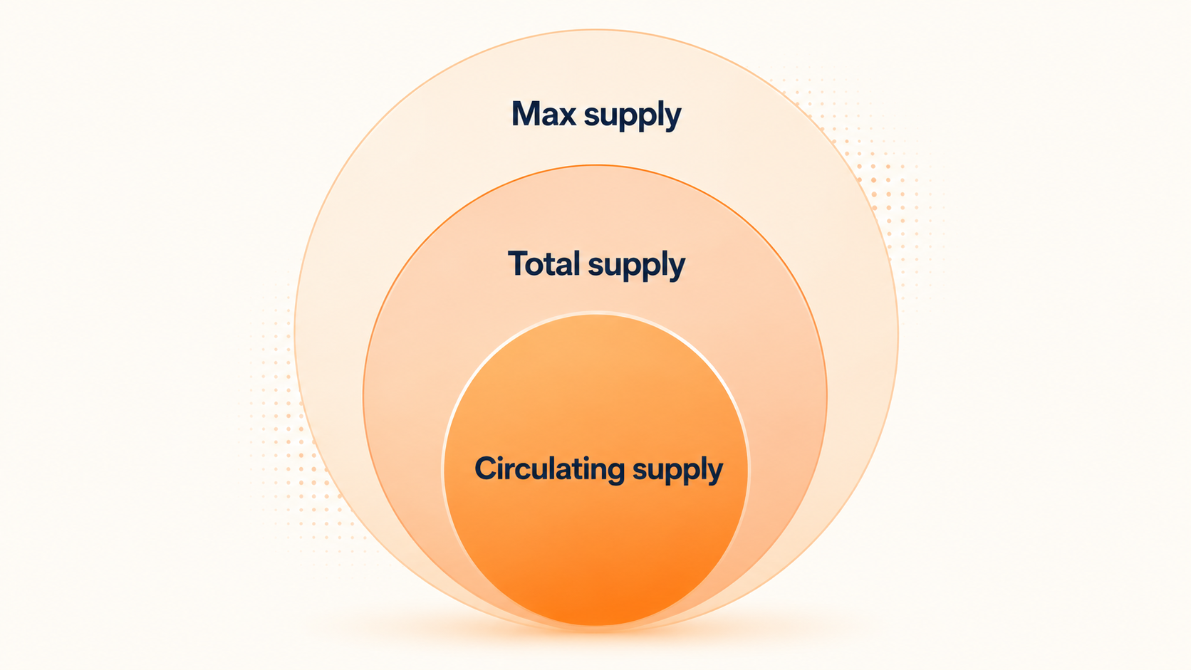
Supply is often the first thing people look at – and the first thing they misread. The number displayed on a tracking site isn’t the full story. There are usually three different supply figures in play, and the gaps between them matter more than any single number.
Understanding supply doesn’t require a finance background. But tracking what’s still locked – and when it arrives – can completely change how a project looks.
Circulating Supply vs. Max Supply
Circulating supply is the live count – the tokens already unlocked and moving through the market. It’s the number driving the market cap figure you see on CoinGecko.
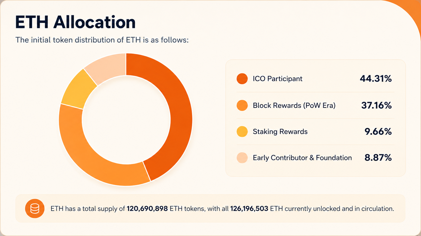
Max supply is the hard ceiling on what will ever exist. Bitcoin’s sits at 21 million. Over 20 million have been mined already – a milestone reached in March 2026 – with the remainder still to come through block rewards over the next century or so. That fixed cap underpins a lot of the store-of-value argument.
When a large portion of a project’s max supply isn’t yet in circulation, more tokens are coming. How many, and when, matters considerably. A low circulating supply can make a token appear cheaper or smaller than it actually is when viewed against its full potential supply.
Market Cap vs. Fully Diluted Valuation
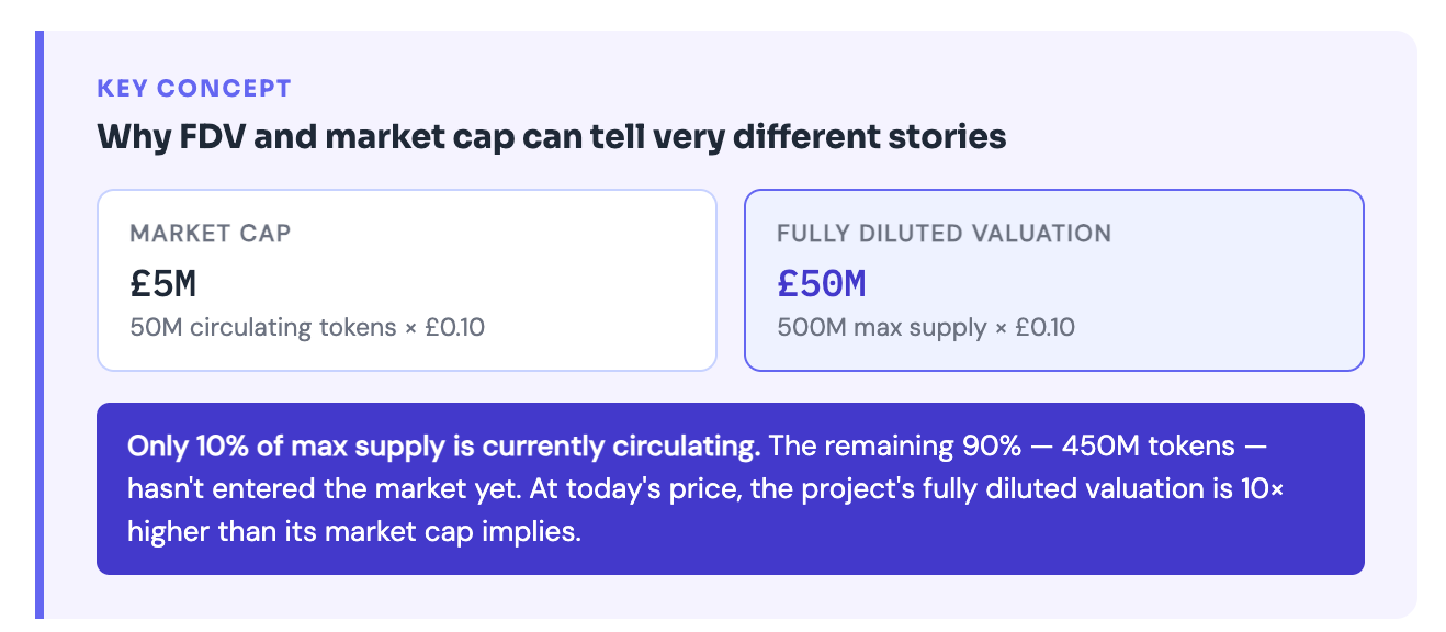
Market cap is calculated using circulating supply multiplied by the current price. Fully diluted valuation, or FDV, uses the total max supply at the current price – as if every token that will ever exist were already trading.
If a token has a market cap of £300 million but an FDV of £3 billion, that gap tells a story. Most of the supply hasn’t arrived yet. If and when it does at current prices, the implied valuation would be ten times higher than today’s market cap suggests.
This matters most when comparing projects. A newer token might look small by market cap relative to established competitors. But if 90% of its supply is still locked, its FDV may already price in growth that rivals took years to achieve.
A low market cap isn’t always a sign of upside. Sometimes it just means most of the supply hasn’t shown up yet.
What Creates Demand for a Token — and When Is That Demand Weak?
Supply mechanics only matter if people actually want the token. A well-designed supply schedule with no genuine demand doesn’t hold value. The source of demand is where projects often diverge most sharply – and where many are weaker than they appear at first glance.
Real demand can come from several directions. The question is whether any of them are durable.
Utility, Access, and Governance
Demand for a token can come from several places. Some tokens are required to pay fees within a protocol. Others are used to earn staking rewards, or to access specific services. Some give holders a vote on how the protocol is run.
Take Uniswap’s UNI token: it gives holders voting power over one of the biggest decentralised exchanges in the space. AAVE works similarly – token holders can weigh in on risk parameters and how the lending protocol’s treasury gets used. Governance utility doesn’t guarantee a token’s value – you can vote and still lose money – but it creates a structural reason to hold beyond pure speculation.
Not all utility carries equal weight. Some tokens are described as essential to their protocol but can be substituted or bypassed in practice. Others are used only for governance over a protocol that generates minimal activity. The useful question is whether the token’s role is genuinely embedded in how the product works, or whether it sits alongside it as a separate optional layer.
Incentives vs. Real Product Demand
Emissions and rewards can create the appearance of strong demand. When a protocol pays users in its own token to provide liquidity, borrow funds, or stake assets, activity picks up quickly.
Compound’s COMP distribution in 2020 is the clearest historical example. Yield farmers flooded in while rewards were high and attractive. When better opportunities appeared elsewhere or incentives were reduced, much of that activity rotated out. The demand was real in the short term; the stickiness wasn’t.
Incentives serve a genuine purpose in early-stage protocols: they attract users, generate activity, and help establish liquidity before a project has built a large organic user base. The question is what remains once the incentives ease.
If users hold or use a token mainly because of what it pays them right now, that demand has a shelf life. The more revealing test: would people still use this protocol if the token rewards disappeared tomorrow?
How Do Inflation and Emissions Affect Token Holders?
In tokenomics, inflation means new tokens entering circulation over time. That supply can come through staking rewards, liquidity mining programmes, scheduled team vesting, ecosystem grants, validator payments, or a combination of all of them.
The effect is straightforward. If new tokens enter the market faster than demand grows to absorb them, the value of each token faces downward pressure – even if the project itself is performing well on other metrics.
Why Token Inflation Is Not Always Bad
Inflation isn’t automatically a problem. Ethereum issues new ETH to validators as a reward for securing the network. Without that payment, the proof-of-stake model doesn’t function. The inflation is doing a job: paying for security.
New token emissions also help bootstrap ecosystems during early growth phases. Developer grants, community incentive programmes, and ecosystem funds all draw on token supply to attract talent and activity that a protocol couldn’t fund otherwise.
Ethereum’s EIP-1559 upgrade changed this by burning a slice of each transaction fee rather than paying it out. In busy periods, the burn rate can outpace new issuance entirely. The network ends up removing more ETH than it creates – a deflationary outcome built into how the chain itself runs.
When Inflation Becomes a Red Flag
Inflation becomes a problem when emissions stay high while real demand stays flat or declines. If the protocol is issuing tokens at a steady rate but the user base isn’t growing, existing holders are being diluted without corresponding value creation.
The worst-case version is a feedback loop. High emissions attract yield farmers who sell the token to capture returns. That selling pressure pushes price down. Lower prices make the protocol less attractive. Reduced activity weakens the case for holding. More selling follows.
Projects that rely too heavily on token incentives to generate their user metrics are particularly exposed to this dynamic. When the emissions tap is eventually turned down – or runs out – whatever genuine demand remains becomes visible.
Watching the ratio of emissions to real network growth is one of the more reliable ways to separate sustainable tokenomics from protocols that are temporarily propped up by their own rewards.
What Does Token Unlocking Mean and Why Do Investors Watch It So Closely?
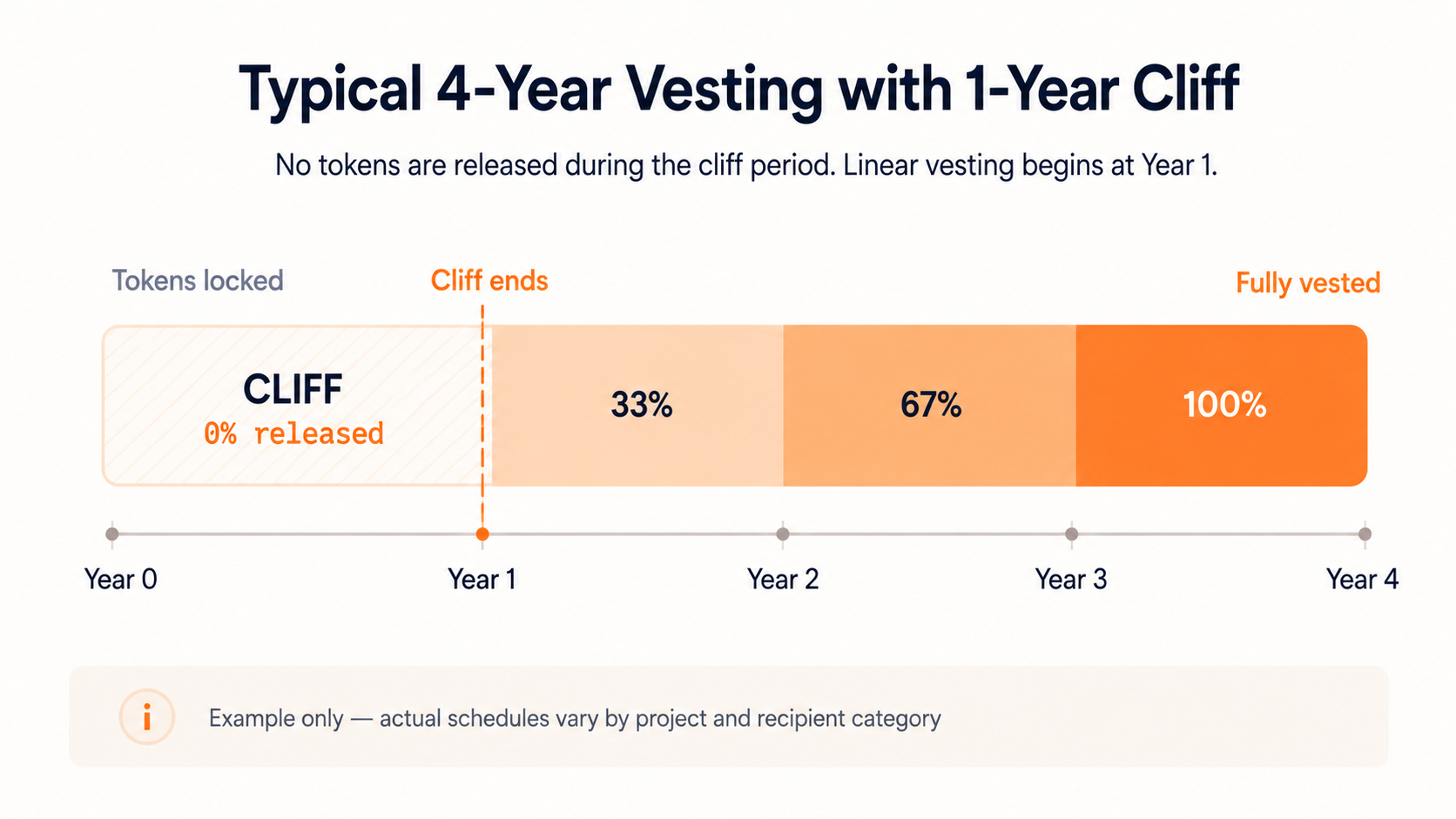
Most tokens aren’t fully in circulation when a project launches. A substantial portion is locked: held by the team, early investors, advisors, and various programme allocations, under a vesting schedule that determines when they become tradeable.
Unlocking is when those locked tokens enter the market. The schedule gets set out in the project’s tokenomics documentation, usually from day one. Unlock dates get watched closely by anyone sizing up a position.
Who Usually Gets Unlocked Tokens?
The main recipient categories are fairly consistent across most projects. Teams and founders typically receive a significant allocation, vesting over three or four years with a one-year cliff – meaning no tokens are released in the first year, followed by gradual monthly or quarterly unlocks thereafter.
Early investors and venture funds are in a similar position, though exact cliff and vest periods depend on what was negotiated. The rest of the allocation typically covers advisors, a treasury reserve, ecosystem development, and community incentive programmes – each running on its own release schedule.
Each category tends to behave differently once tokens become liquid. A long-term strategic investor might hold through an unlock. A fund managing risk across a broad portfolio might rebalance. A team member who joined early and has been waiting years might take some money off the table. These differences matter when thinking about how an unlock is likely to play out.
Why Unlocks Can Create Sell Pressure
When locked tokens become tradeable, some holders will sell. The scale of that selling depends on the size of the unlock relative to daily trading volume, how long holders have been waiting, and what price they originally received the tokens at.
A small, gradual unlock from a project with deep liquidity and genuine demand can pass without much visible market impact. A large cliff unlock – where a significant percentage of total supply becomes tradeable in a single event – from a project with thin volume and investors sitting on substantial gains is a different situation.
Aptos (APT) unlock events attracted significant attention from market participants who tracked the vesting schedule ahead of each release. The awareness itself shapes market behaviour around these events, often well in advance of the actual date.
Sites like Token Unlocks track upcoming vesting schedules across hundreds of projects. Many investors check these before entering or sizing a position – and before deciding whether to hold through an upcoming cliff date.
Why Does Token Distribution Matter as Much as Supply?
Two tokens can have identical supply figures and completely different market dynamics depending on who controls that supply. Distribution is what headline numbers alone don’t show.
Who actually holds the tokens matters as much as how many exist. A handful of insiders controlling the majority creates completely different dynamics from a project with wide community ownership – even when the on-paper figures look identical.
Team, Investors, Treasury, and Community Share
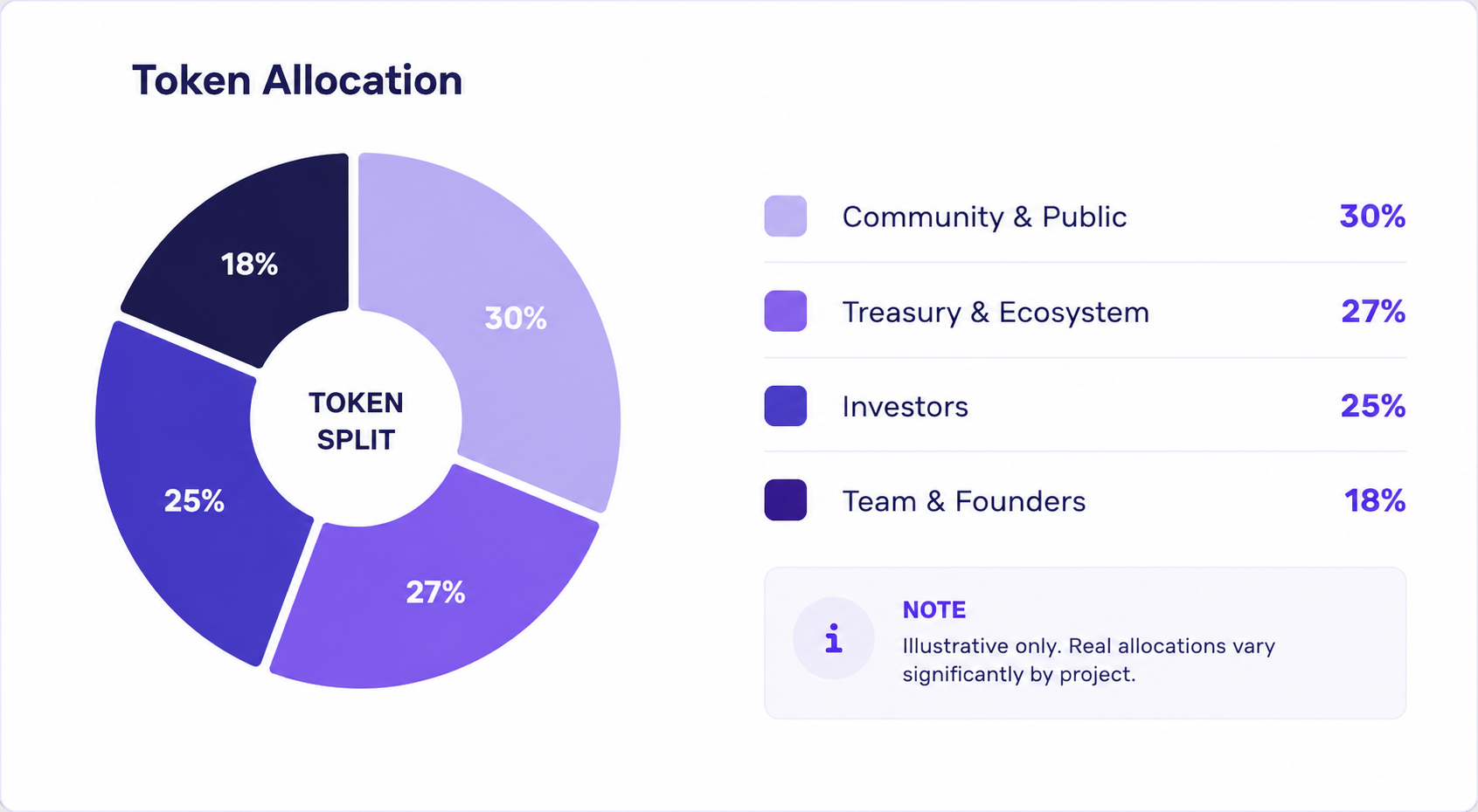
Most projects lay out their token allocation in a whitepaper or on a dedicated tokenomics page. Team and founders generally take somewhere around 15–20%. Investors get a similar chunk, sometimes more. A treasury or ecosystem fund often accounts for another 20–30%, with the rest spread across public sales, airdrops, and incentive programmes.
The percentages matter less than the conditions attached to them. A “community allocation” sounds broadly positive, but the details count. If those tokens drip out through grants that the founding team controls, or sit behind a governance vote where insiders hold most of the voting power, the distribution is far more concentrated than the headline percentage implies. The pie chart looks balanced. What it represents often isn’t.
It’s also worth looking at how the community allocation actually reaches users. Airdrops, public sales, and open liquidity mining programmes reach a broad audience. Ecosystem grants that flow to a handful of approved developers do not. The tokenomics of a project can look diverse on a pie chart while functioning quite differently in practice.
Concentrated Ownership and Its Risks
When a large proportion of a token’s supply sits in a small number of wallets, several things can follow. Governance votes can be effectively decided by insiders before broader community input makes a meaningful difference. Large sells from a single wallet can move markets in ways that dispersed ownership wouldn’t.
A project becomes more dependent on the continued good behaviour and aligned incentives of a few large holders. That’s manageable when those incentives align with long-term growth, and a problem when they diverge.
On-chain data makes concentration visible. Tools like Arkham Intelligence and Nansen allow anyone to inspect how tokens are distributed across wallets and trace flows over time. NFT projects in particular have faced scrutiny here: several high-profile collections launched with insider allocations that weren’t clear from public-facing materials, only becoming apparent through on-chain analysis after launch.
What Should You Actually Check Before Buying a Token?
The good news is that most of this information is public. Whitepapers, tokenomics documentation, CoinGecko, CoinMarketCap, and on-chain explorers together cover the main data points you’d want to look at.
The harder part is knowing which numbers to examine together, and which combinations should give you pause. The table below takes the sections above and turns them into a working checklist – a practical starting point for evaluating any project before committing.
Which Tokenomics Red Flags Should Make You More Careful?
None of these signals automatically mean a project is a poor choice. But each one calls for closer scrutiny before committing.
A very low circulating supply paired with a high FDV means a lot of tokens are still to come. If the current valuation already prices in significant growth, the maths on future returns gets tighter as that supply enters. This isn’t a dealbreaker on its own, but it’s worth being honest about what you’re actually pricing in.
Large upcoming unlocks are worth tracking, particularly from investor or team allocations where recipients have been holding for an extended period. The key variable is size relative to daily trading volume. A 3% unlock on a project with substantial daily liquidity is a different proposition from a 3% unlock where the event itself would significantly expand the typical daily float.
Thin or unclear token utility is common and often overlooked. If a token’s main role is governance over a protocol with minimal real activity, or if it’s labelled a “store of value” without any structural mechanism to support that claim, its demand is largely speculative. That’s not necessarily wrong – plenty of speculative assets perform well – but it’s honest to recognise it for what it is.
Heavy reliance on emissions to sustain activity deserves a hard look. Ask what happens to user numbers and transaction volumes if emissions are cut significantly. If the honest answer is that things drop quickly, the demand picture is more fragile than the headline metrics suggest.
Concentrated insider ownership – particularly combined with large upcoming unlocks – is the last flag, and often the most consequential. It doesn’t indicate bad intent, but it means a small group has significant influence over both price and governance decisions. That’s worth understanding before you’re holding the token.
Conclusion: What Does Good Tokenomics Really Mean?
Good tokenomics isn’t about having the smallest supply or the most aggressive burn schedule. It’s about whether supply, demand, incentives, and distribution are designed to work together over time – and whether that design holds up when you look past the headline figures.
The projects that tend to have the most coherent tokenomics share a few things. Utility that’s genuinely embedded in the product rather than added as an afterthought. Inflation mechanics tied to real network activity rather than arbitrary emission schedules. A distribution structure that doesn’t consistently work against the holders it’s supposed to benefit. Transparency about when locked supply will enter the market and why.
No project gets all of that right from day one. But the ones that have genuinely thought through the long-term mechanics – and are honest about the trade-offs – tend to be far more readable from the outside.
That’s where tokenomics analysis earns its keep.
Disclaimer: The content provided in this article is for educational and informational purposes only and should not be considered financial or investment advice. Interacting with blockchain, crypto assets, and Web3 applications involves risks, including the potential loss of funds. Venga encourages readers to conduct thorough research and understand the risks before engaging with any crypto assets or blockchain technologies. For more details, please refer to our terms of service.