
Table of Contents
Opening a crypto exchange for the first time feels like walking into a spaceship’s control room, red and green sticks jumping everywhere, flashing numbers, and total chaos.
Most beginners just trade on vibes, but if you’re buying a coin based on hype rather than data, you’re gambling, that is not trading.
Technical Analysis (TA) is the skill that turns that confusion into a strategy. By learning to read charts, you stop relying on guesswork and start recognizing the footprints of the market. It’s actually knowing when to enter and exit a position like a pro.
Mastering this visual language is what separates the people losing money on "hype" from the ones actually building a portfolio.
Why Does Learning to Read Crypto Charts Matter?
A crypto chart serves as a visual summary of market behavior, showing thousands of individual trades into a single, readable story.
By looking at these patterns, you can identify clear trends, logical entry points, and potential risks. Instead of guessing where the price might go, you are using the collective actions of all market participants and circumstances to make a more informed choice.
Understanding these charts provides a massive leg up in the volatile crypto market. It allows you to stay cool when prices swing wildly, giving you the tools to spot golden opportunities that are invisible to those dancing FOMO.
Ultimately, being able to interpret the data yourself is the best way to protect your bag and keep your feet on the ground when the market starts acting like a rollercoaster.
What Are the Key Elements of a Crypto Price Chart?
At first glance, a crypto chart looks like a mess of neon geometry, but it is actually built on a few simple, non-negotiable components: Price (Y-axis) and Time (X-axis), Candlesticks and Volume.
Price, Volume, and Market Capitalization
Price represents the current value at which an asset is trading. While it’s the most tracked metric, it only shows a snapshot of what buyers and sellers agree on at a single moment, rather than the project’s total value.
Volume reflects the total trading activity over a set period. It acts as a reality check for price moves; high volume suggests a healthy, liquid market with strong participation, while low volume can indicate that a price move lacks real support.
Market Capitalization indicates the overall size and stability of a cryptocurrency. Calculated by multiplying price by circulating supply, it is a much better gauge of a coin’s market weight than price alone. High-cap coins generally offer more stability, whereas smaller caps are often more volatile and sensitive to market swings.
Axes, Chart Scales, and How to Interpret Them
To read a chart effectively, you must first understand its layout.
The X-axis at the bottom is your timeline, stretching from the past on the left to present on the right.
The Y-axis on the side is the price tag of the asset. How you view this price depends on the chart scale you choose.
Most people start with a linear scale, where every dollar move looks the same. But if you want to see the real story, try the logarithmic scale. It measures moves by percentages rather than just dollars.
This is a cool feature in crypto because it lets you see that a jump from $1 to $10 is just as significant as a jump from $1,000 to $10,000. It’s the best way to keep your perspective when things get volatile.
Why Candlesticks Are the Core of Chart Reading
Candlesticks are those red and green bars that tell you where the price started (open), where it ended (close), and the highest and lowest points it touched during that window ( could be a day, a week or years).
This detail allows you to see the battle that took place between buyers and sellers.
For instance, a long wick at the top of a candle shows that buyers tried to push the price up but were ultimately rejected by sellers. By revealing the volatility and price action within each time block, candlesticks offer a narrative of the market that a basic line simply cannot capture.
What Types of Crypto Price Charts Exist?
Not every chart is the same, and the crypto chart you choose depends on how much of the story you want to see. Here are the three most common ways to track the action:
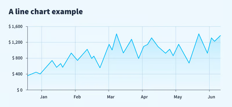
Line Charts
The line chart is a simple, elegant line that connects only the closing prices. It’s perfect for when you just want to know, "Is this thing going up or down?" without getting a headache from the details. It’s great for beginners who want to block out the noise and focus on the long-term trend.
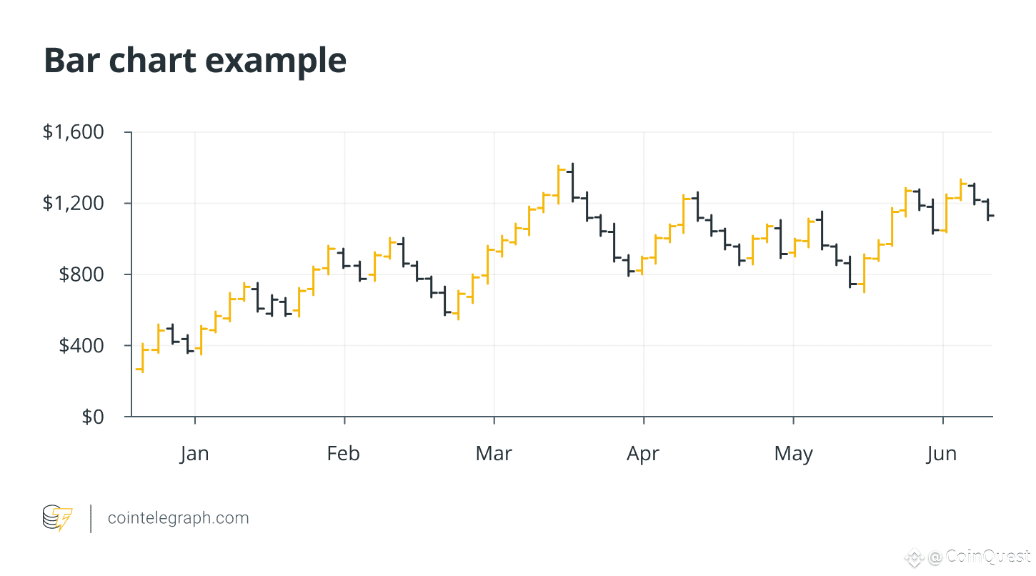
Bar Charts
Bar charts are for those who want a bit more data but like a minimalist aesthetic. Each bar looks like a thin stick with two little arms. The left arm is where the price opened, the right is where it closed, and the top and bottom of the stick show the highest and lowest prices hit. It’s more detailed than a line, but it’s definitely the minimalist's choice.
Candlestick Charts
The MVP of the crypto world. Candlesticks take the data from a bar chart and wrap it in a colorful body. If the body is green, the bulls (buyers) were in charge, if it's red, the bears (sellers) took the win. These are the gold standard because they tell you exactly how much drama happened in the market, helping you spot when traders are feeling brave or when they're about to panic.
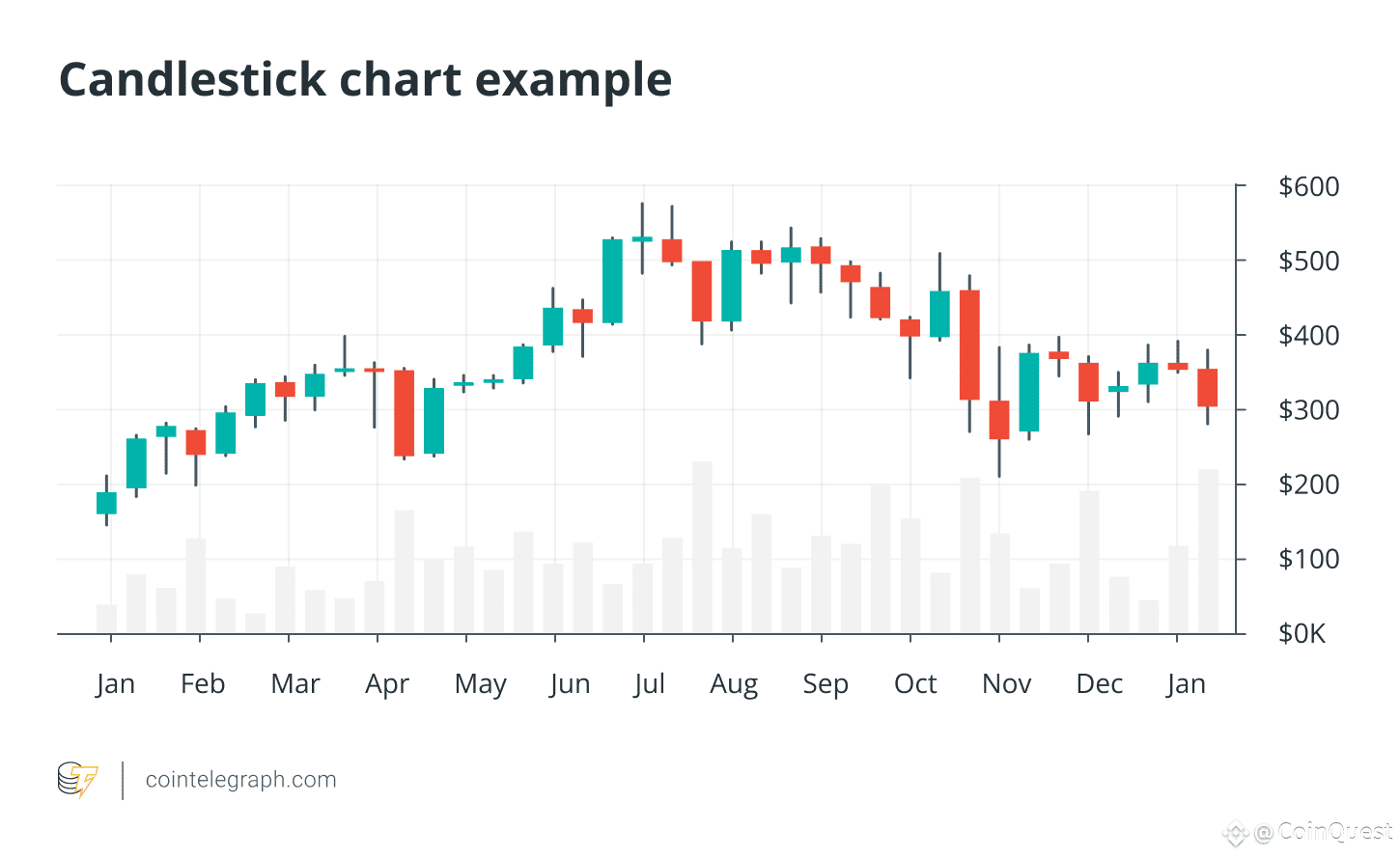
How Do You Read Candlestick Charts?
If a regular chart is just a line, a candlestick chart is a storybook. It shows you exactly what happened during a specific time, like a single day or within an hour.
Anatomy
Every candle has a story why it looks that way:
- The Body: The thick middle part. It shows where the price started (Open) and where it ended (Close).
- The Wicks: The thin lines on top and bottom. They show the High and Low points, the mountaintops and valleys the price visited before the day ended.
Bullish vs. Bearish
The color tells you exactly which team won the game:
- Green (Bullish): The buyers (Bulls) won. They were stronger and pushed the price up higher than where it started.
- Red (Bearish): The sellers (Bears) won. They took control and pulled the price DOWN lower than the start.
- Doji: This looks like a plus sign (+). It’s a total tie. Neither side could move the rope, so the price ended right where it began. The market is just standing there, undecided.
- Engulfing: This is when a giant candle swallows the tiny candle from the day before. They took over the whole playground and sent the other team packing.
Why Traders Prefer Candlestick Charts
Traders would rather go for candlestick charts because they act like a mood ring for the market. By looking at these shapes, you can see if traders are feeling brave, scared, or confused.
For example, a long wick on top shows that people got excited and bought, but then got nervous and sold.
A big, solid green body shows that everyone is feeling confident. Instead of just looking at numbers and math, you are seeing a simple picture of the feelings of thousands of people trading at once.
What Essential Chart Concepts Should Beginners Know?
Just the visuals alone are intimidating. As a beginner, there are some basic things that you will need to know in order to understand the charts along your journey to becoming a pro.
The Importance of Timeframes
Timeframes are your perspective, the horizon you are seeing. If you change the zoom, you change the story:
- Intraday (1m - 15m): This is the noise. It’s for people who enjoy high blood pressure. It’s great for fine-tuning an entry, but if you base your entire thesis on a 1-minute candle, the market will eat you alive.
- The Daily/Weekly (The Macro): This is where the clearer picture is. It filters out the fake-outs and shows you where the big money is actually moving.
Always check the weekly trend before you obsess over a 5-minute dip. Don't lose the forest for the trees.
Trend Lines and Price Channels
A trend line is a visual representation of market conviction.It’s a line you draw to see if the price is generally climbing, sliding, or just hanging out.
- The Upward Trend: You draw a line connecting the bottoms of the price dips. As long as the price stays above this line, the market is in a good mood. If the price falls through the line, the party might be over.
This line represents the collective limit of patience for buyers, once it breaks, the shared belief in the rally collapses, often triggering a domino effect of panic selling. - The Downward Trend: You draw this line across the tops of the price bounces. It shows you that every time the price tries to recover, it gets slapped back down. You don’t want to buy here until the price finally breaks above that line.
Here, It is only a matter of time, every minor recovery is met by weary investors just looking to break even and exit the market. - Sideways (The Waiting Room): Sometimes the lines are flat. This means the market is bored and undecided. It’s usually best to wait for the price to pick a direction before moving.
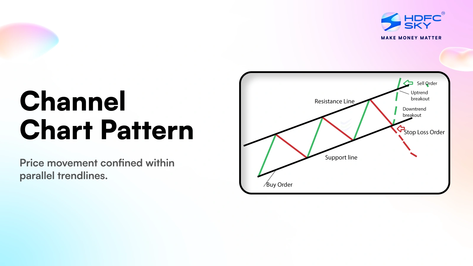
This is a time when people feel confused because their beliefs don’t match what’s really happening, where neither the bulls nor the bears have a dominant narrative, resulting in a tense standoff where everyone is waiting for someone else to make the first move. - Price Channels: This is when you have two parallel lines: a floor and a ceiling. The price bounces between them like a ball in a hallway. It tells you exactly where the normal zone is, so you know when a breakout is actually happening.
What is a Fibonacci Retracement ?
You should already know that markets rarely move in a straight line, they breathe in and out. After a big move up or down, the price usually moves back a little before continuing the trend.
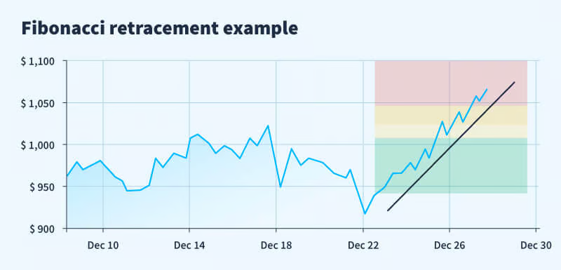
Fibonacci levels (specifically 38.2%, 50%, and 61.8%) act as invisible elastic bands that predict where that pullback will stop and reverse.
Instead of guessing where a dip will end, you use these mathematical ratios to identify high probability zones where buyers or sellers are likely to step back in.
Which Technical Indicators Are Core for Chart Analysis?
Indicators help filter market noise. Price matters, but indicators help confirm if a move is real or fake.
Let's see the difference indicators, to know them is to succeed:
Relative Strength Index (RSI)
Here is your market thermometer, It measures the speed and change of price movements on a scale of 0 to 100. Generally, an RSI above 70 suggests an asset is overbought (overheated), while an RSI below 30 suggests it is oversold (undervalued).
Simple Moving Average (SMA)
It acts as a smoothing tool. It takes the average closing price over a set period (like 50 or 200 days) . It removes the small daily noise so you can clearly see whether the market is going up or down overall.
Exponential Moving Average (EMA)
This is the SMA but faster with more energy. It pays more attention to the latest prices than older ones. Because it reacts quickly to new information, traders use it to catch short-term trend shifts before they become obvious.
Moving Average Convergence Divergence (MACD)
It uses two lines to compare and show if the price is speeding up or slowing down. Watch for the crossover. When the MACD line crosses above the signal line, it’s a bullish, Go signal. When it crosses below, the momentum is dying.
Volume Indicators: OBV and Volume Profile
While On-Balance Volume (OBV) tracks whether buying and selling pressure over time, Volume Profile (VP) shows at what price the most trading happened, indicating areas of high activity.
If the price goes up but OBV goes down, the move is a lie,there’s no real money backing it.
How to Analyze a Crypto Chart Step by Step
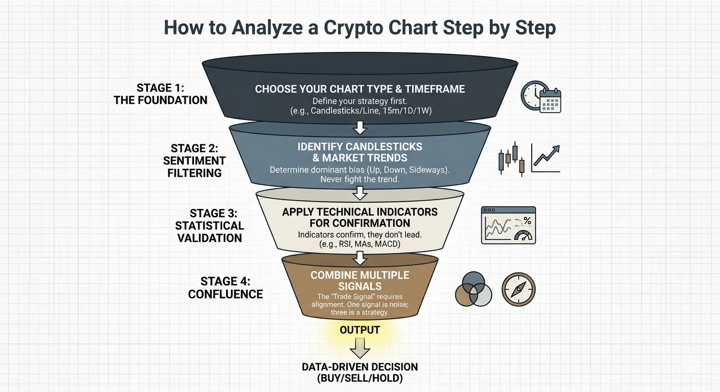
Building a house you begging from down working your way up. Your journey begins by picking the right view, choosing a timeframe and style that matches how long you plan to stay in the market.
Once your view is set, you simply watch the price to see if it’s climbing, sliding, or resting using candlestick patterns and bullish or bearish trends to catch the general mood of the crowd.
To make sure your eyes aren't playing tricks on you, you bring in a few simple technical indicators to act as a second opinion confirming the price action with hard data.
The magic happens at the very end when you stack these different signals together, when the trend, the patterns, and the indicators all agree, you can stop second-guessing yourself and move forward with total confidence.
Advanced tips for crypto chart reading
Getting yourself on a safe path will mean having skills in chart reading that go beyond the basics, here are a few tips on how to smooth your skills :
- Using Multiple Timeframe Analysis: This can not be emphasized enough. You start with the long-term chart (like the 1-Day) to see the big picture and then zoom into a shorter timeframe (like the 1-Hour) to find your specific entry point.
- Combining Indicators Without Overloading: Combining indicators but without overloading your view. 2 to 3 tools that do different jobs for example one for trend (Moving Averages) and one for momentum, Enough to give you an analytical view.
- Spotting and Avoiding False Signals: Most importantly, are you able to spot and avoid false signals? Can you stay calm when there is a lot of noise? Sometimes the market fakes left before going right. A fake breakout (or "Bull Trap") happens when the price jumps above a line, convinces everyone to buy, and then immediately crashes back down. You will need to get all your tools ready.
What Common Mistakes Should Beginners Avoid?
At this point in crypto you will know it does not only end at making money, It ends at being able to keep the money you have made. Avoiding these errors will guarantee you don't leave the market empty handed:
Relying on a Single Indicator
This is bad, avoid it. A single indicator is like a single witness in a court case, they might be right, but you’d feel much better with a second and third person saying the same thing.
No tool is 100% accurate. For example, the RSI might say "Oversold" while the price continues to drop for another week. Here more is better.
Ignoring News and Market Fundamentals
Could you even be successful in a market where you are not updated? You can draw the most beautiful chart in history, but a sudden event like a major exchange hack, a shift in government regulation, or a change in interest rates will shred that chart in seconds.
Technical analysis tells you the "how," but fundamentals often provide the "when" and the "why." so one eye on the chart, the other on the economy.
Emotional Trading Based on Short-Term Moves
Trading is a game of logic, but humans are creatures of emotion. If you are going to be a pro in your game, your emotions need to go for a short siesta. Seeing a sudden 5% green candle and jumping in out of FOMO usually results in buying the exact top.
Decide your entry and exit points when you are calm and rational.
Conclusion
Learning how to read charts will mean that you have moved from guessing to knowing. Mastering your tools will give you a calm environment that is not influenced by the market noise, your emotions will not run your market decisions because you know what is going on. Through sharp technical analysis and rock-solid risk management you are finding opportunities. Start simple, stay consistent, and let the data lead you.
Disclaimer: The content provided in this article is for educational and informational purposes only and should not be considered financial or investment advice. Interacting with blockchain, crypto assets, and Web3 applications involves risks, including the potential loss of funds. Venga encourages readers to conduct thorough research and understand the risks before engaging with any crypto assets or blockchain technologies. For more details, please refer to our terms of service.